


The purpose of this activity was to set out to design a portfolio which reflected my personality, which is important as a portfolio is about yourself. A portfolio should not only display your work, but reflect who you truly are.
To begin, we set out as a group to collect two set of 3 words each: 3 that
described you as a person and 3 that you thought were important for
making a website. The words I believe that reflected my personality were:
modest, quiet and "a sense of humour" (not quite one word, but that shows
that I like to live life on the edge). The words I chose regarding a website
were: minimal, effective and modern. With this in mind, I moved on to
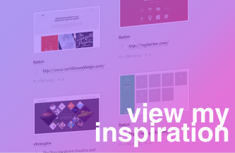
finding inspiration for my portfolio. To do this I used Tumblr to collect
screenshots of portfolios and other websites that grabbed my attention and
which also fit with my previously mentioned words. You can view the
tagged Tumblr posts to the right of the text.
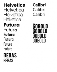
After this, I moved on to deciding on the fonts and colour scheme.
I decided to stick to sans-serif fonts as this reflected my "minimal" choice
in the prior activity. I decided to use Helvetica and Futura as my two main fonts to use across the portfolio. I like them as they are minimal and modern yet date back to 1957 and 1927 respectively. Despite
them being cut back and simple I believe they are aesthetically pleasing
without the need for for fancy serifs. I chose to use Helvetica as the main font
for headers, body text and for any other necessary purpose. I saw Futura as
more of a decorative font to an extent, so I came to the decision to use this
for my logo and navigation menu.
I then moved on to choosing my colour scheme. Again, I decided to keep it
minimal with shades of grey on a white background. But, despite this I decided
to include a pink and blue gradient for use in some elements of the website.
It sounds garish but I believe the clash worked well and also tied into the word;
contemporary.
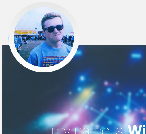
With these point decided, I moved on to make a logo. Originally it was a photo of myself placed in a circle to add a more personal touch, but this seemed unfitting and more suited for a social network profile which indicated it was going too informal and laid back.
Instead I created a single element logo based around my name, Will. I wanted something simple
that could also be adapted to be a back button on particular pages to avoid clutter of many
different elements and to also make the website navigation more sleek.